
No-one should be shut out from help. And for those of us working in the voluntary, community or social enterprise sector in particular, it’s vital that our work is accessible to all.
But it can be hard to know where to start. How do you make sure that visually impaired people, for example, can access everything you have to offer?
Here are ten top tips to make sure that no-one is left out.
1. Colour contrast is important
It’s especially important for visually-impaired people, but it also makes life easier for everyone. Take a look at the two images below. Which one jumps out at you more?

Neurodiverse people, dyslexic people and those with limited sight will find it much easier to use high colour contrast images, but so will everyone else. It’s a win-win.
2. Font choice is important too
There are some pretty amazing fonts out there. They can be hard to resist. But do resist them. No matter how beautiful or swirly or fun a font is, it’s not always the best choice. Take a look at the pictures below again. One of those is much easier to read, and unfortunately, it’s not the fancy swirly one…


To make your text accessible, try to use a Sans Serif font in size 12 or larger (and the bigger the better). Don’t know what I mean by a Sans Serif font? This article explains it well.
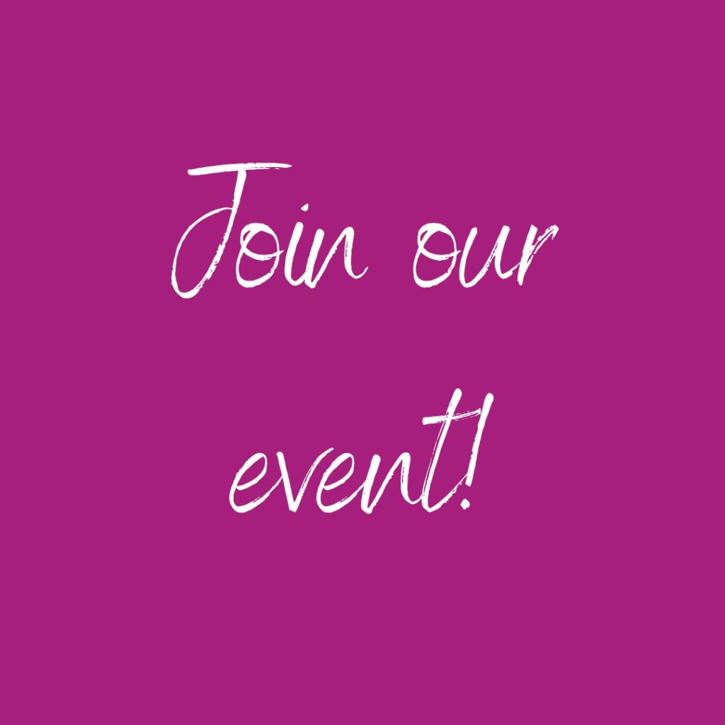
3. Don’t rely on an image to tell people crucial info
I’ve definitely been there. You make a nice poster for an event, slap it on social media and think that’s all there is to it. But if you want to make sure your event is accessible to everyone, there’s one more thing you need to do.
For those who are using a magnifying tool on their computer, images of text can become really pixelated. Imagine seeing an event, thinking that you might want to go, and then struggling to know where or where it is because all you can see is a sea of pixels.
And for those using screen readers, a single image isn’t going to be any use at all (unless there’s alt text…but that’s for another point).
How do you fix it? Just make sure that wherever you post the image, you also type out the information that’s on the image. That way everyone gets a chance to know about it.
4. Use alt text
Not everyone can see the images that you put online. Some people use screen readers or text-to-speech software, which means that they hear the page read out loud. Whenever the technology comes to an image, it can’t explain on its own what’s in the picture. Instead it reads something called ‘alt text’.
The problem is that people often forget about adding alt text to images. It’s easy to miss. But it can be incredibly frustrating for someone who’s trying to engage with your work. They know that they’re missing out on something, but they just don’t know what. Image how annoying that would be. What is it you can’t see that everyone else can?
The way to fix this is to add alt text to your images. What’s alt text? Basically, it tells people what’s in an image. So if an image fails to load, alt text will display in its place.
Alt text also helps determine search engine ratings, which means that if you’ve got lots of alt text, Google will bump you up the page when people search for you. So alt text is pretty great all round.
Very occasionally, you might feel that an image is purely decorative and there’s no need for alt text. This is very, very rare. Maybe you have a border on your page, and people don’t need to know about it. If you really feel that there is no way at all that the image is relevant, you can fill in the alt text box with alt=””
But for the rest of the time, fill in the alt text box with a proper description.
(Psst…here’s how you add alt text on social media. And here’s how to add them on your website if you’re using WordPress).
5. Write good alt text
So you’re happy to write alt text, you’ve found the box to type it in…but what on earth do you write?
Good alt text tells people what is in the image. It’s specific and concise. What it doesn’t do is start with ‘Image of’, ‘Graphic of’ or ‘Photo of’, because that’s really alienating for anyone accessing it.
Here’s an example:
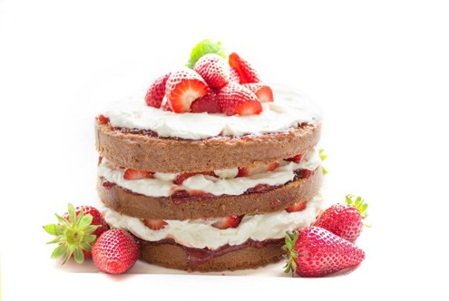
Bad alt text: “image” or “cake”
Better alt text: “A cake with strawberries”
Good, descriptive alt text: “A three-layered cake sandwiched with cream and strawberries, with a small mound of strawberries on top and to the sides.”
That way, everyone can get the full cake (or dog, or volunteering, or anything else) experience.
3. Think about image descriptions
There’s a lot of confusion out there about image descriptions and alt text, and sometimes I’ve seen people use them interchangeably. For me, the easiest way of understanding it is this:
Image descriptions are a short description in the body of text that accompanies an image. That means that they’re not written in the alt text box. They’re written alongside the image.
Say you’re posting a photo of your dog on social media. You’d write the alt text in the alt text box. But you’d also write an image description in the post itself, like this:

Lovely walk in the woods!
[Image description: Small light brown dog running on a dirt path through the woods. There are trees in the background and the path is dappled with shade. It is sunny and the dog looks as though it is smiling or excited.]
If you’re struggling to know what to write, use the formula ‘Object, Action, Context’. Start with the focus on the image, then describe what is happening, then describe the environment. This is how I wrote the image description above, and mirrors how we might look at an image. Don’t forget to add emotion, too. This dog isn’t sad or sleepy or angry. It’s happy and excited, and that’s a really important part of what the image is trying to convey.
Why bother? Because sometimes people don’t use screen readers (so can’t read alt text) but struggle to see the whole picture. We want to include those people too.
7. Have a podcast? Provide a transcript
Why wouldn’t you want the whole world to be able to hear your podcast? Get the word out there by providing a transcript. This will improve audio accessibility.
It’s really easy to do. In fact, there’s software to do this for you. Otter, for example, has a free plan.
8. Make videos? Provide closed captions
Closed captions are clever subtitles that also contain necessary contextual sounds, like a door slamming or background music. You can take advantage of auto-closed captions on YouTube and Instagram, which do them for you. Here are the instructions for setting it up on Instagram – and here are the instructions for setting it up on YouTube.
9. Think about your hashtags
The best way to make your hashtags accessible is using CamelCase. Not only does it have a great name, but it makes your hashtags easier to read. All it means is that each word in the hashtag is capitalised. So instead of #thecamelcrew, it would read #TheCamelCrew.
This means that neurodiverse people are able to read hashtags much more easily. It’s also helpful for people who use screen readers. And it’s also helpful for everyone else, because it’s so much clearer!
Finally, while we’re on hashtags, always put hashtags at the end of your posts. It’s much better for people who are listening through headphones.
10. Consider using the social model of disability
As this excellent article explains, the Social Model of Disability states that people have impairments but that the oppression and exclusion they face is not an inevitable consequence of having an impairment. Instead, it’s caused by the way society is run and organised.
And there we have it! We’re working on improving our accessibility at CAS, but are always keen to hear suggestions about how we could do more. If you have any questions or suggestions at all, get in touch with our Marketing & Communications Manager, Katie Read: [email protected]
